

You can tell within a minute whether a dispensary is easy to shop. If the path feels crowded and the signs make you squint, browsing turns into guesswork.
In a licensed store, dispensary layout signage does more than fill space. It lowers friction, sets expectations, and helps you compare products without feeling rushed. That matters in New York City, where first-time shoppers, regulars, and curious visitors often share the same floor.
The strongest stores guide you with space, sightlines, and plain-language signs before staff ever step in.
Key Takeaways
- Strong dispensary layouts create clear zones from entry to checkout, with wide aisles and open sightlines that reduce crowding and let you browse at your pace.
- Layered signage using plain language—category headers, shelf details, and product tags—makes finding and comparing items fast and intuitive, without squinting or guesswork.
- Consistent sign structure, readable fonts, and strategic placement confirm you’re in the right spot, lowering mental load so you focus on products, not decoding the store.
- In NYC’s busy environment, polished yet clear designs handle first-timers and crowds, blending compliance with warm flow for a calm, professional experience.
- Layout and signage work together: one guides your path, the other answers your questions, turning a crowded room into an easy space to shop.
Why the floor plan shapes your first impression
When you walk in, you read the room before you read a menu. The first few steps tell you where to wait, where to browse, and whether you can move at your own pace.
That first zone matters because people need a second to adjust. Bright lights, store entrance signage, ID check signage, security check-ins, and a full menu wall can overload you if they hit at once. A calmer entry gives you a beat to understand the room before you make choices.
A strong floor plan makes that easy. You enter, check in, and then see a path that opens up instead of tightening. Products on showroom floor stands and inventory displays sit in clear zones, so flower doesn’t blend into edibles, and vapes don’t disappear behind a busy counter. If everything is visible at once, the store feels noisy. If too much is hidden, you hesitate.
Some retail teams in New York describe this as a flow problem, where the room should help you move from entry to discovery to checkout with a queuing system, without dead ends or crowding. That idea shows up in guidance on running a New York dispensary, which stresses first impressions and customer movement.

In practice, that means wide aisles, open sightlines, and a checkout area that doesn’t swallow the room. It also means staff can stay available without standing in your way. You should feel free to pause at a display, circle back, or ask a question when you’re ready.
Good layout also reduces pressure. When products are grouped by type, potency range, or use format, you spend less time scanning and more time comparing. That helps newer shoppers most, but it also respects regular customers who want to browse quickly.
Good retail flow gives you choices without making you hunt for them.
Clear signs make browsing faster and calmer
Even the best layout falls short if the dispensary signage is vague. You may know what you want, but you still need to find it fast. If you don’t know what you want, dispensary signage becomes your map.
The best signs work in layers. Wall category headers tell you the broad category. Shelf signage gives the next level of detail. Smaller tags or placards in acrylic sign holders answer the final question, such as format, strength, or price range. Each sign has one job.

Plain language matters. “Flower,” “pre-rolls,” “edibles,” and “vapes” work because you can scan them in a second. Digital menu boards enhance this readability further. Dense jargon slows you down. So do long lists, tiny type, low contrast, and too many competing messages. When every surface asks for attention, nothing feels clear.
Consistency matters as much as wording. If price, size, and potency appear in different spots from one shelf to the next, you keep re-learning the display. Good signs repeat the same structure with shelf edge graphics. Your eyes know where to look, so comparison gets easier. Readable fonts and strong contrast also help people scanning displays from a distance.
You also notice placement more than most retailers think. A sign above eye level helps you orient across the room. A sign buried inside a case with display case products helps only after you’ve already stopped. That’s why good dispensary signage pairs room-level direction with close-up product context, including countertop displays. Store design guidance for New York dispensaries often highlights this layered approach, including visual grouping and readable category cues, as seen in design advice for New York cannabis retail.
In licensed cannabis retail, signs also carry operational weight. They help separate check-in from browsing, show where lines begin, and make exits easy to spot. They can support advertising compliance and cannabis advertising laws without making the room feel cold. The key is restraint. You want the required information visible, but you don’t want warning language to overpower every shelf.
When the balance is right, cannabis retail displays lower your mental load. You stop decoding the store and start paying attention to the products.
What strong browsing design looks like in NYC
New York City adds its own pressure. Storefronts can be narrow with window graphics drawing crowds, sidewalks stay busy, and many visitors are walking into a licensed dispensary for the first time. Because of that, layout and signage need to do more than look polished. They need to calm the room with polished branding like halo lit channel letters and face lit channel letters.
The most effective stores break the visit into clear zones. You check in, move into browsing, and then step toward consultation or checkout when you’re ready. That structure keeps traffic moving, but it does not feel like a queue maze. Warm materials with custom LED signage, readable lighting, and uncluttered cannabis retail displays help too. You want the space to feel professional and easy to read, not clinical or chaotic.
That approach also helps mixed groups navigating local regulations, with medical marijuana signs guiding both novices and experts. One person may want quick direction, while another wants time to browse. Clear zones let both move comfortably without the store feeling split between experts and beginners.
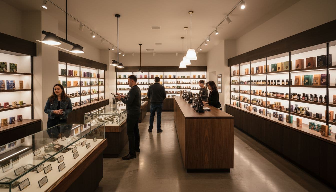
Recent coverage of NYC dispensary design trends points to the same lesson. Customers respond to spaces that feel warm, intentional, and easy to browse. High style elements like cabinet signs, raceway mounted signs, double faced signs, shaped cabinet signs, and LED pedestal signs can help, but clarity matters more. If you can spot product categories, understand the flow, and move without bumping into other shoppers, the design is doing its job.
Staff placement matters here too. When consultation points sit near key decision areas, you can ask for context without losing your place in the store. That’s why dispensary layout and signage work best together, enhanced by visual merchandising solutions. Layout shapes where you go. Signage confirms that you’re in the right place. One without the other leaves gaps. Together, they turn a room full of products into a space you can actually use.
Frequently Asked Questions
Why does floor plan matter for first impressions?
The first few steps set the tone: a calm entry with ID checks and clear paths prevents overload, letting you adjust before browsing. Wide aisles and zoned products keep flower separate from edibles, avoiding a noisy feel. This flow respects both quick regulars and curious newcomers.
What makes dispensary signage effective?
Effective signs use layers—wall headers for categories, shelf tags for details like potency and price—in plain language that’s scannable from afar. Consistency in placement and format means your eyes know where to look every time. Avoid jargon, tiny fonts, or clutter to keep browsing calm and quick.
How do NYC stores handle crowds and first-timers?
NYC dispensaries use open zones for check-in, browsing, and checkout to manage narrow spaces and busy sidewalks without mazes. Polished elements like LED signage and warm materials calm the room for mixed groups. Clear signs guide novices while letting experts move fast.
Why pair layout with signage?
Layout shapes where you go, but signage confirms categories and details, filling gaps for smooth movement. Without both, you hesitate or feel lost amid products. Together, they create clarity that outperforms staff alone in busy moments.
How do signs support compliance without feeling cold?
Signs mark check-ins, lines, and exits while meeting advertising rules, using restraint so warnings don’t dominate shelves. Layered designs blend required info with product focus, keeping the space professional yet inviting. This balance reassures without overwhelming.
Conclusion
A good browsing experience starts before you speak to anyone. It starts with a floor plan that feels open and dispensary signage that answers your next question at the right moment.
When a licensed dispensary gets those basics right, you feel oriented instead of overwhelmed. In a city full of options and short attention spans, clarity is what makes browsing work.


