

Walking into a licensed dispensary should feel simple. You should know where to go, what to ask, and how to compare products without feeling lost.
In New York City, where many adults are still getting used to the recreational cannabis market, small points of friction can shape the whole visit. A strong dispensary experience comes down to clarity, not flash. That starts the moment you step inside.
Key Takeaways
- Clear check-in, logical layout, and visible signage make the first five minutes smooth, reducing mental load in a cannabis store.
- Helpful budtenders start with your preferences, explain products simply, and guide without pressure or sales pitches.
- Transparent menus show type, size, cannabinoids, and price upfront, while smooth checkout handles basics like cash options and limits without surprises.
- Clarity in space, service, and operations creates a professional dispensary experience that builds trust over flashy design.
The first five minutes tell you almost everything
A polished shop doesn’t leave you guessing at the door. If the check-in process, security, and line flow are obvious, you settle in faster. If the entrance feels cramped, staff roles are unclear, or the waiting area lacks dispensary etiquette, confusion starts before you see a single product.
Layout matters because cannabis retail asks more of you than a typical store. You may need to show a valid ID or state-issued ID, wait for a staff member, review a menu, and compare formats that aren’t familiar yet. Checking the online menu beforehand can help streamline the visit. Clear signs, open sightlines, and logical category groupings cut that mental load.
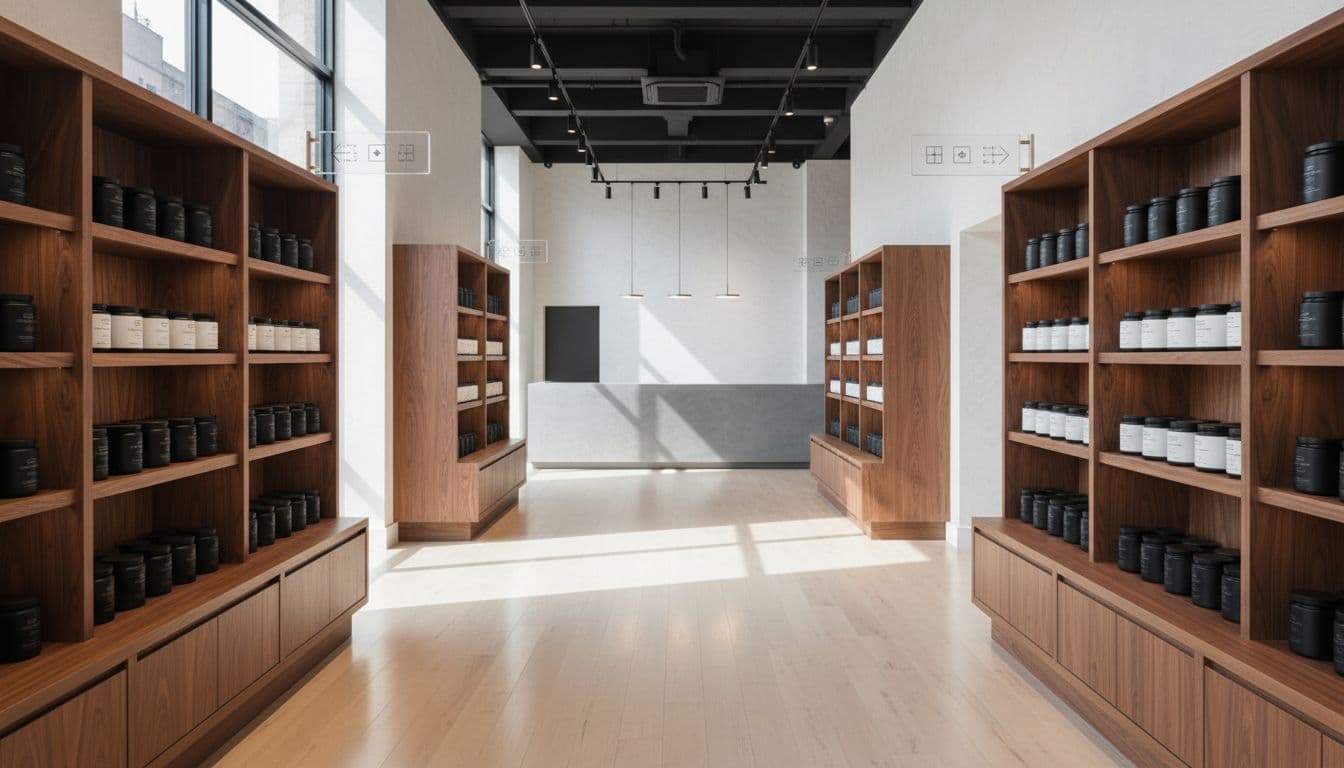
You can spot the difference quickly:
| Polished visit | Confusing visit |
|---|---|
| Check-in is easy to find | You wonder where the line starts |
| Product categories are grouped clearly | Similar products sit in mixed sections |
| Staff are visible and approachable | You don’t know who can answer questions |
| The next step is obvious | Each step feels like a surprise |
Store design isn’t cosmetic. It affects comfort, pace, and trust. Reporting on New York City dispensary design has made the same point, shoppers often judge the space before they judge the selection.
That doesn’t mean every licensed store needs a luxury look. It means the space should explain itself. When you can move from entrance to menu without second-guessing each step, the dispensary experience already feels more polished.
Helpful budtenders guide you without steering you
Even the best layout can’t fix weak service. Once you start asking questions, the interaction becomes the real test.
Good budtenders don’t throw product names and THC numbers at you. They ask where you are starting from. Do you prefer flower, pre-rolls, vape cartridges, edibles, concentrates, or topicals among our cannabis products? Are you looking for something lower-dose, or do you already know your tolerance? They guide you on consumption methods and finding the right balance of THC content and CBD, often advising to start low and go slow. That kind of conversation gives you context without pressure.

A confusing visit usually has one of two problems. Either nobody offers help, or the help feels like a sales pitch. Both leave you unsure. A polished dispensary experience feels different because the budtender translates store language into plain English. They explain package size, product type, and basic differences, highlighting terpene-rich options, without talking down to you.
A strong cannabis retail interaction leaves you informed, calm, and free to decide.
That standard is showing up in NYC. In coverage of a licensed city dispensary, staff describe starting with simple questions about how a person likes to consume and how much guidance they want. That approach works because it respects your time and experience level.
You can also spot good training in smaller moments. Budtenders keep explanations short. They don’t hover while you browse. They admit when an item is out of stock. They also know where compliance matters, such as age limits, ID checks, packaging rules, and what they can’t say about effects. Tipping budtenders is a natural part of the service experience. When those basics are handled with confidence, the store feels organized, not improvised.
Clear menus and checkout details prevent last-minute friction
Confusion often peaks near the register. That’s where vague menus, hidden totals, or weak labeling turn a decent visit into an irritating one.
You shouldn’t need a long back-and-forth to learn what a product is, how much is in the package, or why the final total changed. A polished store makes those details visible early, and it might even offer a rewards program for returning customers or a drive-thru option for convenience. Product displays separate formats clearly. Menus show type, size, cannabinoid information, and price in a way you can scan fast.
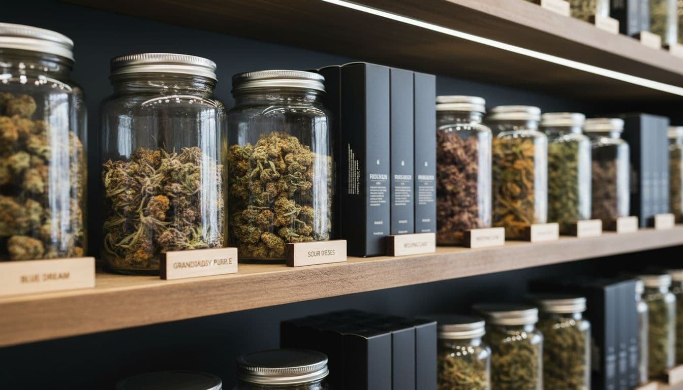
Good checkout flow also respects the basics. If the store is cash only, an ATM should be available on-site, and that should be obvious before you reach the counter. If orders are filled from a back room, staff should explain the wait. If there are purchasing limits or inventory changes, you should hear that before the final handoff.
Operational guidance for New York dispensaries points to the same practical issues, quick and accurate sales reduce stress at the counter. The same theme appears in retail operations guidance for adult-use stores, which treats customer experience and compliance as part of the same job.
Most importantly, the store should never make you feel rushed into a choice you don’t understand. When the menu, the labels, and the checkout process all match, the visit feels straightforward.
Frequently Asked Questions
What makes the entrance and layout of a dispensary polished?
A polished entrance has obvious check-in, security, and flow, with clear signs and open sightlines. Logical product groupings and visible staff prevent confusion from the start. Checking the online menu beforehand can further streamline your visit.
How should a good budtender interact with customers?
Good budtenders ask about your experience, preferences like flower or edibles, and tolerance before recommending. They translate product details into plain English without hovering or pushing sales. They handle compliance like ID checks confidently and admit when items are out of stock.
Why is the checkout process a common source of confusion?
Vague menus, hidden totals, or unclear basics like cash-only policies create friction at the register. Polished stores display details early, explain waits or limits upfront, and avoid rushing decisions. This predictability lets you focus on your choices.
Does a dispensary need luxury design to feel professional?
No, clarity trumps flash—simple, self-explanatory spaces work best. Shoppers judge comfort and trust from layout and service before selection. In NYC’s market, these basics benefit both medical and adult-use customers.
Final thoughts
A polished dispensary experience doesn’t depend on trendy design or the biggest menu. It depends on clarity. When the space is easy to read, the staff are calm and informed, and the checkout process is predictable, you can focus on the decision in front of you.
That is what separates a store that feels professional from one that feels confusing. These professional standards benefit the cannabis community, whether you shop with a medical marijuana card or for adult-use. In a licensed NYC market, clear retail basics still make the biggest difference. Remember to enjoy products in a private residence to align with local regulations.


