
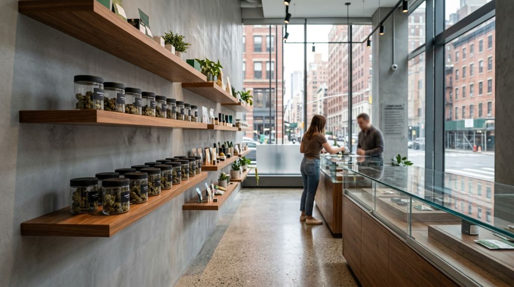
A licensed dispensary can lose your confidence in seconds with weak cannabis branding. If the shelf looks crowded or the packaging is hard to read, the store feels less reliable.
That is why dispensary brand presentation matters more now than it did when legal retail first opened. In NYC’s maturing market, the target audience of adults 21+ expect a store to look controlled, compliant, and easy to understand, which shapes strong brand positioning. The details on the sales floor shape your customer experience before staff says a word.
Key Takeaways
- Dispensary brand presentation builds instant trust by signaling control, compliance, and clarity before staff interaction or product details.
- Clear visual hierarchy, category breaks, and consistent branding reduce decision friction, helping customers compare formats like flower, vapes, and edibles faster.
- In NYC’s maturing market, restrained designs with simple labels, local identity, and regulatory alignment stand out over flashy packaging.
- Full alignment across shelves, packaging, menus, and store interiors creates cohesive experiences that boost recognition and loyalty.
In licensed retail, presentation signals trust
When you step into a legal store, you read the room before you read a label. Clean counters, ordered shelves, and clear category breaks tell you the operator has standards. Dispensary branding provides those visual signals of trust. That first impression matters because legal cannabis still competes with old habits and leftover confusion.
In New York, brand presentation also has to live inside real rules. New York branding restrictions for licensed dispensaries ensure regulatory compliance by limiting youth-facing imagery, misleading pharmacy cues, and unsupported benefit claims. So a polished display is not about decoration alone. Interior branding shows that the store and the brands understand the boundaries.
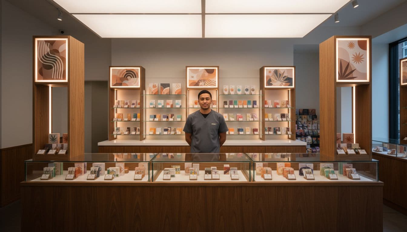
In neighborhoods where legal shops opened beside a history of informal sales, you often decide whether a store feels legitimate long before you ask a question. Presentation closes that trust gap. It helps the retail environment look like regulated retail.
When products are grouped by format and price information is easy to scan, you relax a little. Clear category breaks reflect the brand’s mission and values, so you can compare flower, vapes, pre-rolls, and edibles without feeling pushed. Staff can answer questions from a clear starting point instead of trying to rescue a confusing shelf.
In a licensed dispensary, presentation shows control.
A cluttered display does the opposite. It makes legal products look interchangeable, even when they are not. Better presentation gives each brand enough space to show packaging, basic facts, and tone, while still keeping the store calm and consistent.
Strong brand displays help you compare faster
Many cannabis categories already look crowded. A single case might hold jars, carts, infused pre-rolls, gummies, mints, and drinks. If every package competes at full volume, you do more work than you should.
A good display reduces that friction. First, it creates a visual hierarchy through strong visual identity. Category comes before strain name, potency, or flavor. Then shelf spacing, color blocking, and lighting help you tell one brand from the next without turning the case into a billboard.
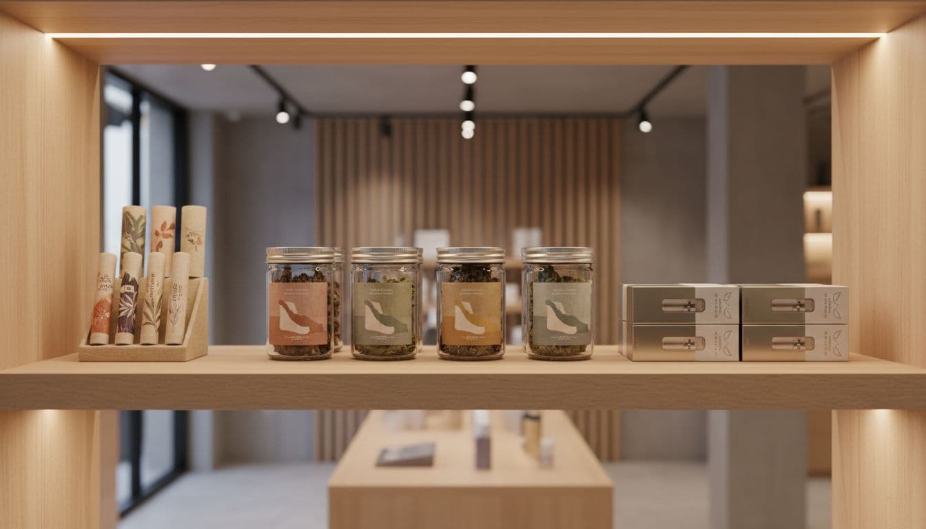
Brand consistency also helps memory and builds brand recognition. If you had a good experience with a brand before, you are more likely to spot it again when the store supports recall. That matters as menus expand and more New York brands fight for the same few seconds of attention.
Well-built displays also help staff stay factual by providing educational content right on packaging and menus. Staff can point to these elements rather than over-describe. That keeps conversations cleaner and reduces the risk of vague claims.
Good presentation does not need to be loud. In fact, restraint often works better, with logo design integrated subtly into the shelf layout. As branding guidance for cannabis businesses points out, packaging may catch your eye first, but the rest of the experience has to hold up. Inside the store, that means fixtures, shelf talkers, menu boards, and staff language should all point in the same direction. This alignment serves as a competitive differentiator and improves the customer experience by reducing decision fatigue.
You can feel the difference when that alignment is missing. A premium package on a messy shelf loses force. A value brand in a well-planned section can look more trustworthy than a flashier rival. In-store branding and merchandising work as one system.
What NYC dispensaries are doing differently in 2026
The legal market in New York looks more mature now than it did even a year ago. Shoppers respond better to a clear, honest brand strategy than to flashy design. They also notice when a brand feels local, steady, and easy to understand.
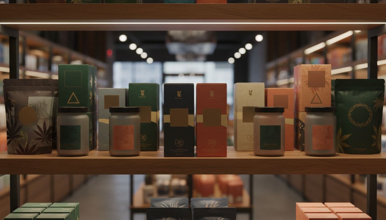
Recent market shifts point the same way. Stronger shelf presence now comes from thoughtful packaging design with simple labels, restrained color palettes, clean typography, tactile finishes, and consistent packaging across product lines. That kind of presentation helps you trust what you are seeing before you compare details on a menu.
Local identity matters too. In NYC, a brand can stand out by feeling rooted in New York through effective brand storytelling without leaning on cliches. You see that in stores that pair clean fixtures with packaging that feels urban, polished, and grounded in place. What matters is recognition.
You also see more discipline between shelf, package, and store interior. Brands that look one way in a menu or listing but another in a case create friction. The strongest ones carry the same brand voice across jars, display cards, menus, and staff education materials.
Category trends affect presentation as well. Pre-rolls and low-dose beverages tied to wellness branding need different display logic than flower jars or vape carts, so stores are giving each format more intentional space. Some brands also extend the in-store experience with QR codes or digital menus that enhance their digital presence. Still, the physical shelf does the first job. If the display is confusing, no screen will fix the first impression.
Frequently Asked Questions
Why does brand presentation matter more now in licensed dispensaries?
In a maturing NYC market, adults 21+ expect stores to look controlled and compliant. Weak presentation erodes trust instantly, while clear displays signal legitimacy amid competition from old habits and informal sales.
How does presentation help customers compare products?
Strong displays use visual hierarchy, shelf spacing, and color blocking to prioritize category over strain or flavor. This makes crowded cases readable, reduces work for shoppers, and lets staff guide from a clear baseline.
What role does regulatory compliance play in dispensary branding?
New York rules limit youth imagery, pharmacy cues, and unproven claims, so polished, restrained presentation shows brands respect boundaries. It turns compliance into a trust signal rather than a constraint.
How are NYC dispensaries evolving their branding in 2026?
Shops favor simple labels, clean typography, tactile packaging, and local storytelling over flash. Category-specific spacing for pre-rolls or beverages, plus consistent voice across physical and digital elements, defines stronger shelf presence.
Why is consistency key across store elements?
Misalignment—like premium packaging on a messy shelf—creates friction and weakens brands. Unified fixtures, menus, shelf talkers, and staff language reinforce identity, cut decision fatigue, and build long-term loyalty.
Conclusion
When you enter a licensed dispensary, dispensary brand presentation shapes trust before any product detail does. In a crowded market, clear brand displays help you judge legality, care, and fit with less guesswork.
That is why presentation now matters almost as much as price and product mix. Clear presentation builds brand awareness and long-term customer loyalty. When shelves are readable, packaging design is consistent, and the store feels intentional, you can make a calmer, better-informed choice.
For legal cannabis retail in NYC, that is a sign of a market growing up. These standards often result from thorough market research and connect to concepts like social equity, with brand archetypes and loyalty programs guiding informed choices.


