

The first few steps into a dispensary entrance shape your entire impression of the brand. If the front door makes you pause, scan, or guess where to go next, the space already feels harder to trust.
That matters even more in modern cannabis retail. In New York City, customers expect a licensed dispensary to feel orderly, safe, and easy to navigate. Whether you are operating a location for adult-use cannabis or providing services for medical cannabis patients, a strong entrance answers basic questions before a visitor even needs to ask them.
Key Takeaways
- First impressions are functional: A dispensary entrance is your brand’s first point of communication, and clarity is more important than aesthetics for establishing immediate trust and comfort.
- Minimize the mental load: A well-designed entry allows customers to understand where to go, what to show, and how to proceed without having to decode complex signage or cluttered navigation cues.
- Security should be calming: While security is a regulatory necessity, it should be presented through welcoming staff interactions and organized layouts rather than harsh, confrontational, or intimidating signals.
- Design for the transition: Success at the door requires careful attention to the transition from the exterior sidewalk to the interior retail space, ensuring that sensory details like lighting, sound, and floor safety remain consistent.
Clarity starts before you reach the door
A welcoming dispensary experience begins on the sidewalk. You should spot the main entrance fast, read the hours, and understand where to walk without hunting for clues. Whether you are arriving by foot or navigating nearby street parking and municipal lots, the path to the door should be intuitive and inviting.
In NYC, that can be harder than it sounds. Narrow storefronts, busy corners, scaffolding, and dense signs compete for attention. Because of that, the best retail location designs keep the visual order simple. The door is obvious, and lighting points you toward it. Window coverage offers privacy, but it does not make the storefront look sealed off. This clarity is vital for customers arriving for curbside pick-up or those searching for a parking lot entrance after navigating a crowded city block.
Retail design often comes down to the first few seconds of orientation. This guide to store layouts and customer flow explains why people hesitate when an entry feels unclear. The same rule applies here. If you need to stop and decode the doorway, the welcome is already weaker.
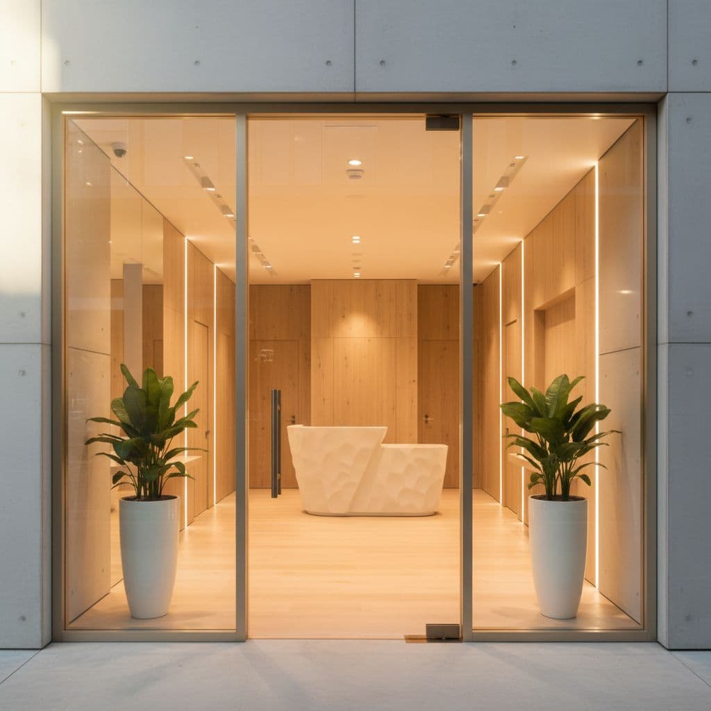
You also read tone before you read words. Clean glass, working lights, tidy trim, and a well-kept threshold suggest care. Faded notices, blocked views, or taped-up paper signs suggest confusion. For a licensed cannabis business, that first signal matters because you want to show that the store takes rules and visitor comfort seriously.
Wayfinding matters more than decor
Many entrances fail for a simple reason: they ask you to figure out too much at once. You see a security desk, a locked vestibule, a menu, age notices, and maybe a line, all before you have taken one full step inside.
A clear entrance reduces that mental load as customers transition from the exterior into the public zone of the store. If you need to verify ID, the signs outlining identification requirements should be easy to spot and easy to read. If there is a queue, the start of the waiting area should be obvious. If the store uses a dispensary verification tool at the desk, it should be clearly visible so guests know exactly where to go before they pass it. That sounds basic, yet small gaps create stress fast.
The best entrance removes doubt. You know where to stand, what to show, and where to go next.
Good retail design also gives you a short pause to orient yourself. A store experience design guide describes that moment when people slow from walking speed to browsing speed. In a dispensary, that pause matters even more because rules, privacy, and product interest all meet at the door.
Accessibility belongs in this same conversation. If the handle is awkward, the step is hard to see, or the path narrows near the door, the space feels less welcoming. Maintaining an accessible entrance is part of overall clarity, not a separate feature.
Security should feel calm, not cold
Licensed dispensaries often require visible security. Still, visible does not have to mean tense. You should feel guided, not challenged, when you approach the entrance.
That starts with posture and placement. A dispensary agent near the main entrance can be reassuring when they greet you, make eye contact, and give short instructions. The same setup can feel hostile if the first thing you meet is a wall of warnings or a person blocking the path without context.
Language matters, too. “Please have ID ready” feels clearer than a cluster of command-style notices. One direct message works better than five competing ones. Meanwhile, security tools should support the experience, not dominate it. Essential measures like video surveillance and a security alarm system are required by state regulations to prevent unauthorized entry, but they should be integrated discreetly. The issue is not the tools themselves, but how they appear in your first five seconds of contact with the dispensary agent.
Privacy also shapes how welcome you feel. Many people do not want to stand exposed on a sidewalk while figuring out entry. A well-designed vestibule, a clear place to queue, and sightlines that do not put the whole sales floor on display can lower that friction. In dense parts of Manhattan or Brooklyn, that matters because foot traffic is constant and personal space is limited.
When security feels calm, you read it as competence. When it feels harsh, you read it as risk.
The handoff inside should feel immediate
The door is only half the story. Once you are through it, the next cue must arrive fast. Otherwise, the entrance still feels unfinished.
You should quickly see where check-in happens, where browsing begins, or where a staff member will greet you. While some stores choose to lean into a speakeasy vibe or a bookshelf entrance for a hidden aesthetic, transparency is often the better choice for a modern retail experience. A clear sightline that leads guests away from the threshold and toward the operations zone or a secure room helps the space feel open and manageable. Once inside, professional budtenders finalize the experience by offering a warm, immediate greeting that puts customers at ease. If the first view is a blank wall, a crowded queue, or a cluttered counter, the space feels tighter than it is.
Sound, smell, and light also shape that handoff. Harsh music near the door can make instructions harder to hear. Dim lighting may feel moody, but it can also make the threshold feel uncertain. Strong scents at the entrance can overwhelm people before they even orient themselves. The most welcoming entrances keep those signals controlled.
Logistics also play a vital role in this transition. The entryway should accommodate the flow of delivery services, and if the layout allows, clearly signposted drive-through services should be visible to minimize confusion. Furthermore, local weather patterns are a major factor. In a city like New York, rain, wind, and slush can turn a doorway into a hazard. Mats that stay flat, doors that do not stick, and space for coats or umbrellas show respect for the actual visit, not just the vision the designer imagined.
A dispensary entrance works best when it feels like a clear first sentence. You understand the tone, the rules, and the next step without effort.
Frequently Asked Questions
Why is the design of a dispensary entrance more critical than other retail stores?
Dispensary entrances must balance retail hospitality with strict regulatory and security requirements. Because customers often navigate complex ID checks or queues, a clear design is essential to lower anxiety and establish the store as a professional, trustworthy establishment.
How can I make my dispensary entrance feel secure without being intimidating?
Focus on staff posture and clear, concise communication instead of aggressive signage. When security agents greet guests warmly and make eye contact, it conveys competence and safety without creating the hostile atmosphere of a “warning-heavy” entrance.
Should I prioritize aesthetics or navigation at my front door?
Navigation always takes priority. While beautiful design can enhance your brand, a space that leaves customers confused about where to stand or how to check in will lead to friction, which undermines even the most visually stunning store layout.
How does the external environment, like busy city streets, influence entrance design?
In dense urban settings, you must compete with visual clutter by using simple, intuitive design elements like high-contrast signage and consistent lighting. Protecting the customer’s privacy and providing a clear, safe path from the sidewalk to the door is vital for maintaining a welcoming transition into the store.
Why the first step matters
A clear, welcoming dispensary entrance does not rely on trendy finishes or loud branding. It succeeds because customers can read the layout quickly, move through the space with ease, and feel confidence from the sidewalk all the way to the point of sale.
For a licensed dispensary, that first impression carries extra weight. When the door, signage, security protocols, and interior cues all align, the space feels credible before any product conversation even begins. That is exactly what turns a standard entrance into a genuine welcome. To ensure a smooth arrival, we recommend that visitors check your address and perform a location verification before heading out. Taking these quick steps ensures you find the correct retail location easily and arrive ready to explore our menu.


